Working Simply Within Limits

When purchasing supplies for the winter, I decided to try the Rublev Colours Zorn Palette, which is composed of only four colors: Lead White, Yellow Ocher, Vermillion, and Bone Black. Named after the Swedish alla prima virtuoso Anders Zorn, this simple selection of colors yields a surprising variety of tones, making it a versatile and practical choice for painters who study from life.
By Frank Ryan
I have been greatly influenced by 19th Century Realist painters, all of whom studied at some point in Paris. I model my approach on the notes on the method used by John S. Sargent and his teacher, Carolous Duran.
The arrangement on my palette proceeds in the same order, with white at the front, pure color at the top rim, and plenty of space between. Using the lead white, I mix a string of tints of each hue that increases in value in three distinct steps. This facilitates choices of more specific mixtures based on observations from the model.
Alla Prima, or direct painting, is a bold way to paint because it is spontaneous. Rather than careful drawing and underpainting in successive layers (in which tone and color are managed separately), the truth of color and tone are sought, mixed, and painted at once!
The key here is simplicity. I have found that sometimes too many colors on a palette can be challenging to manage and that color harmonies can be achieved when exploring the breadth of possibilities in a limited selection of colors. The most important of which is white because of the amount of light it reflects. Good quality whites make all the difference, especially when painting flesh tones, as the tints carry the color.
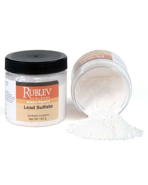
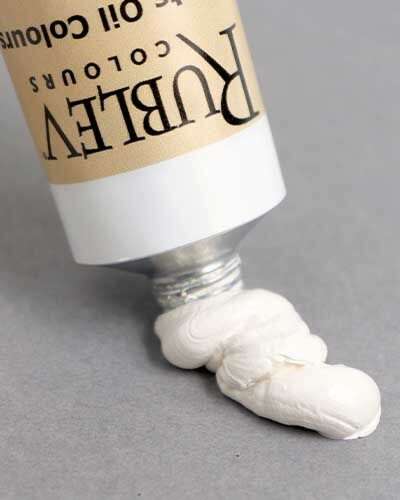
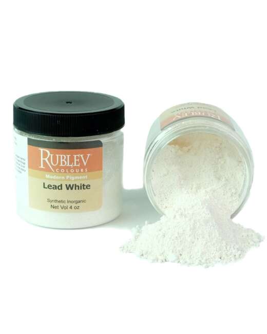
Rublev Lead White #1 is ground in linseed oil, slightly shorter than her sister, Rublev Lead White #2, which is ground in walnut oil. Lead white has excellent working properties, heavy, stable, and plastic, responsive to speed and pressure; semi-opaque and moderate tinting strength; drying relatively quickly, sometimes overnight.
The slow-drying Vermillion mitigates the speedy drying time of Lead White. Historically reserved for manuscript painting, this sanguine pigment is Red Mercuric Sulfide (PR 106), derived from Cinnabar ore. Vermillion has excellent workability, good opacity, and tinting strength. In tints, Vermillion becomes a cool pink blush. In shades, dense and chromatic, perfect for sharp occlusion shadows. The complexion is between Cadmium Red Medium and Cadmium Red Light, though Vermillion is less chromatic.
Blue Ridge Yellow Ocher (PY 43) is a powerful bright ocher pigment with excellent tinting strength, especially in tints. This is very useful for bright highlights and chromatic halftone transitions.
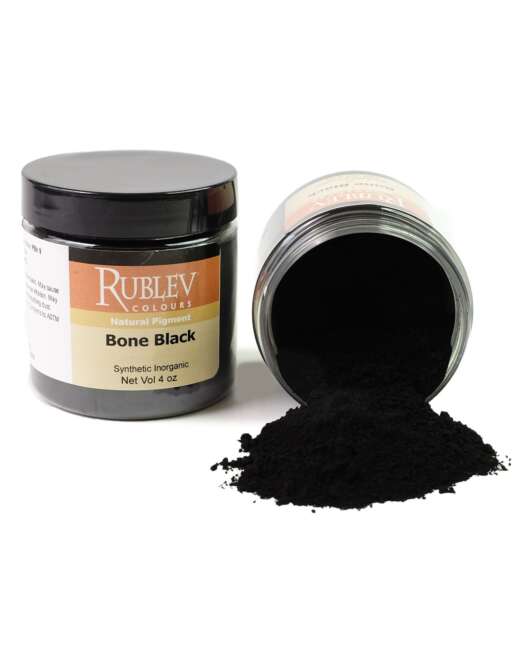
Bone black is an inky pigment of fine particle size made from charred animal bones. I believe black to be the most misunderstood of all the paints. After the impressionists, there seems to be a negative bias towards black and many painters today perpetuate this stance in favor of chromatic blacks. The main complaint I hear is that it ‘kills color,’ which I find funny only because that is why it is useful! Mixing a small amount of gray will neutralize an otherwise intense color.
Many of nature’s colors are relatively low chroma, especially in skin tones. For example, mixing a medium gray with Vermillion yields a muted, dusky violet.
The painting of Bonita (above) above was painted in two sessions during my Life Studies Painting class at CSU Fullerton using the Zorn palette.
I prefer dramatic lighting, as I believe it is easier to identify tonal masses. I lit the model with two powerful halogen lamps on telescopic tripod stands. One was positioned above the model, and she was uplit by the other, which lay on the floor, considerably dimmed.
I began with the arrangement mentioned above and, from these strings, mixed various specific tones based on observations made of the model before me. I prepared three halftones in the lights and two in the darks. Together the ocher, Vermillion, and black to a warm red-brown, I used this to tone my canvas.
Using the next step down of these five tones, the darkest of the halftones, I mapped out the extreme limits of the pose in my composition using a medium-sized flat hog brush-the head, the elbow, the hip, the knee, and feet-creating a constellation of salient points. This approach shows me the proportions and a picture of how my composition will be structured.
Next, I moved up one tonal step from the imprimatur and began to paint in large touches, the larges masses of lights, preserving the halftone of the ground to aid in gradation. Working from the middle towards the extremes is just one approach. I prefer it because it slows the tendency to jump to the tonal extremes and expands the dynamic range.
I always try to work from general to specific, large to small, and coarse to refined in one continuous process. Drawing the human form from observation with the brush is a spectacularly complex endeavor. A versatile, streamlined palette like the Zorn Palette helps lighten the task!
About the Author
Frank Ryan is a contemporary realist painter based in Los Angeles. He embraces the conventions of naturalist representation to reflect on the realities of contemporary American life.


